Investments
The Investments tab allows you to view your linked investment accounts, as well as several charts and graphs to help you analyze your current portfolio.
- Investment Details
- Allocation
- Analysis
The Investments tab gives you an in depth view of your investment portfolio. The initial screen will show your linked investment accounts, which you can click on for a more detailed view. Above, you'll see the total value of your investment portfolio. To the right, you'll see the value of each individual account, as well as the gain or loss on that account based on the cost basis.
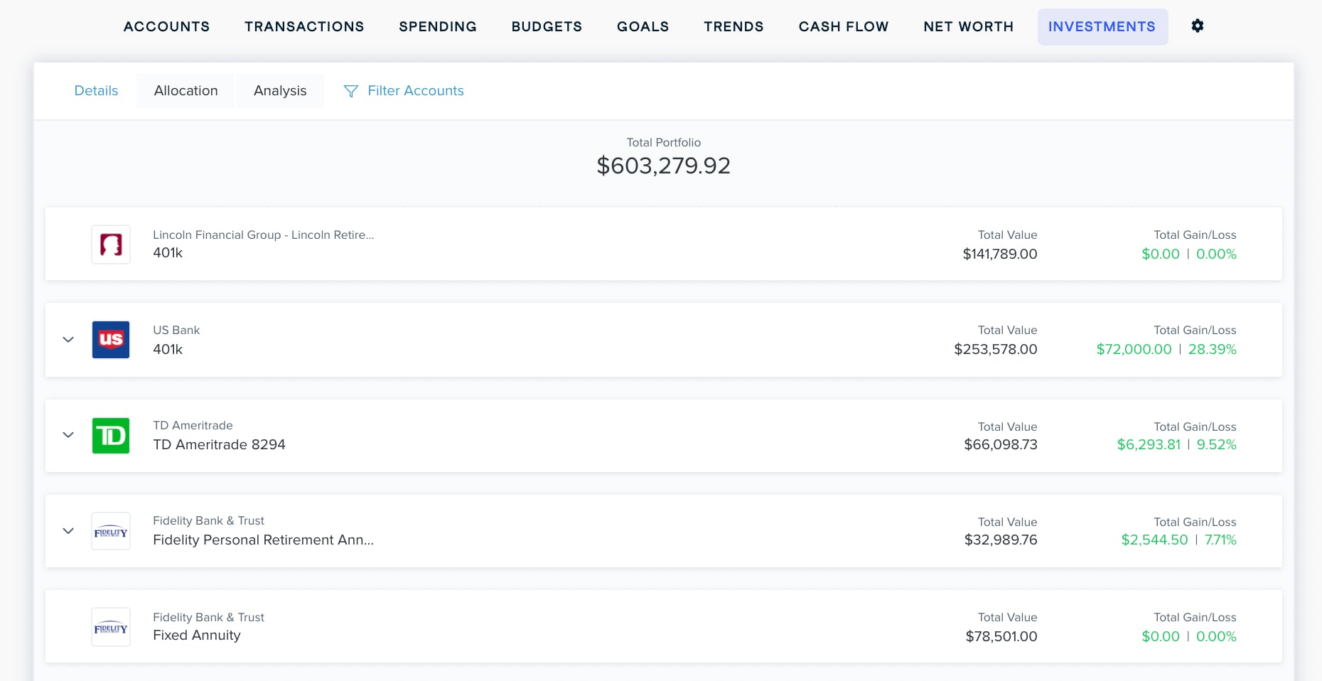
Click on any account to view the specific holdings. The holding's symbol and name are to the left. To the right, you'll see the quantity you own, the cost basis, the current market value of the holding, and the gain or loss since it has been tracked. If your investment includes a cash balance, it will be shown at the bottom of the list.
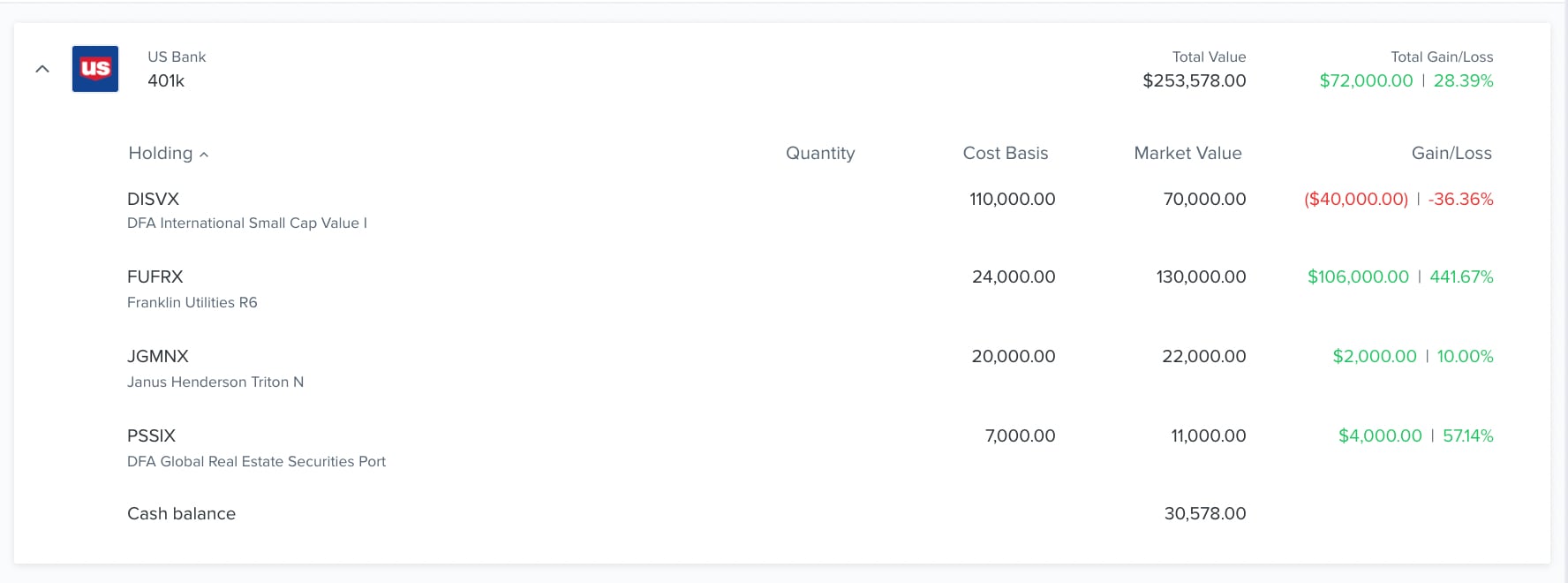
For the software to track your gains and losses accurately, you'll need to know the cost basis of each holding. The cost basis is the original price you paid for a given holding. It may be imported automatically, or you may need to enter it manually.
Click on the ‘Allocation’ tab to view a chart of your current investment allocations. Any of these that account for less than 1% of your portfolio will not be pictured on the chart. You switch between dollar amounts or percentage of your investments by clicking the % or $ above the list on the right.
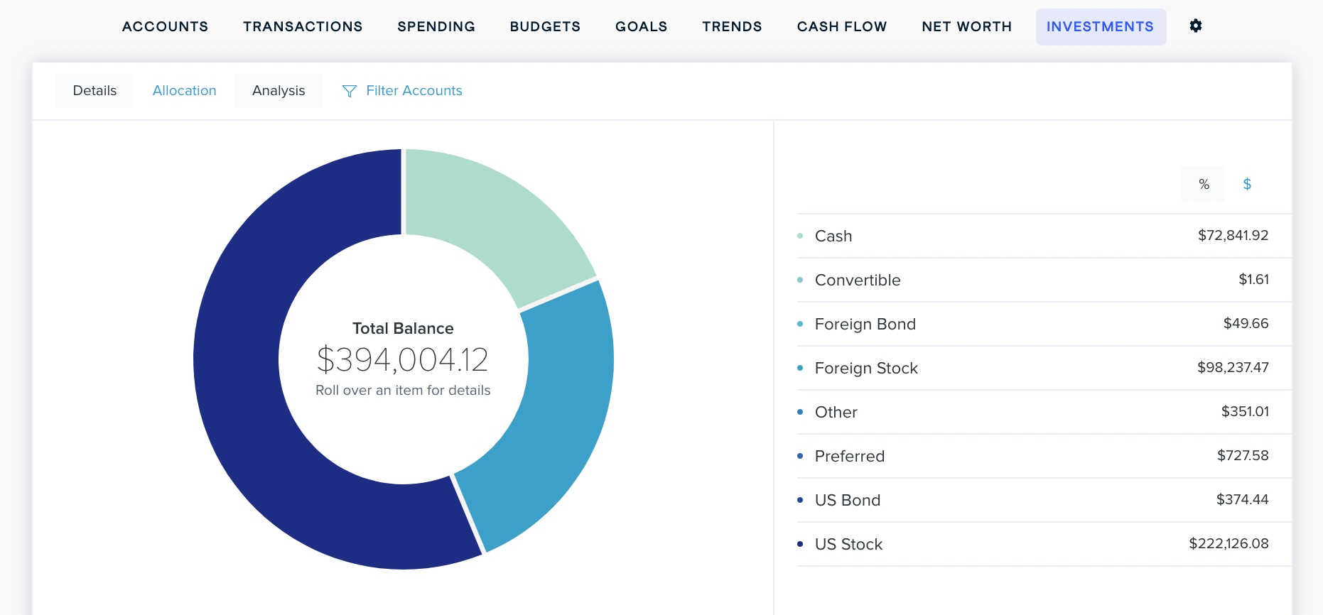
You can filter the accounts included in this chart by clicking ‘Filter Accounts’ at the top of the tab.
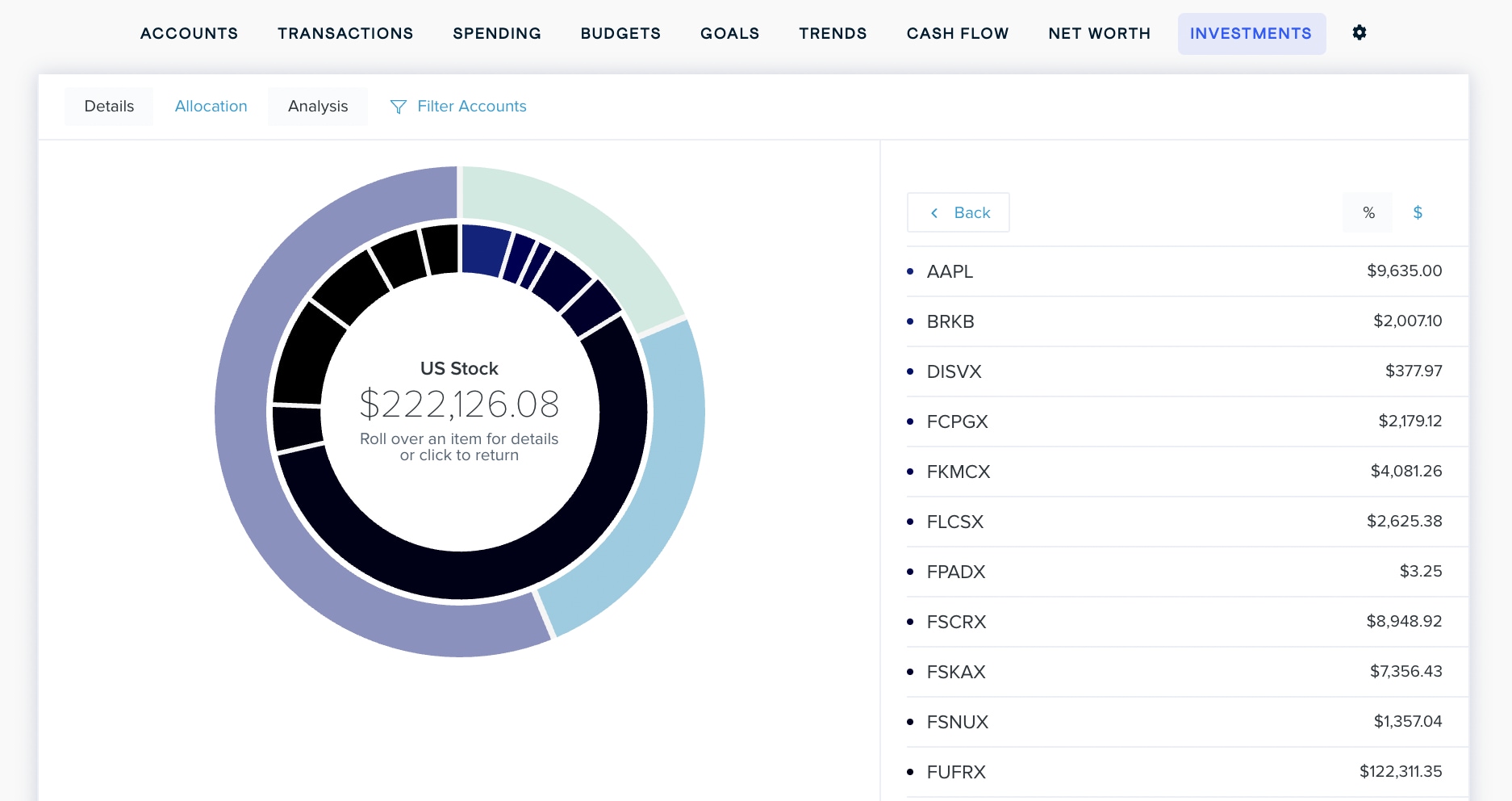
Hover over any section of the investment wheel to see the amount you have invested in that category. Click on any section to view a list of holdings in that investment category.
Click on the ‘Analysis’ tab to view a chart of your investments categorized using factors like quality and growth potential. These categories are displayed as an easy-to-read grid so you can get a quick and accurate read on what kinds of investments you have.
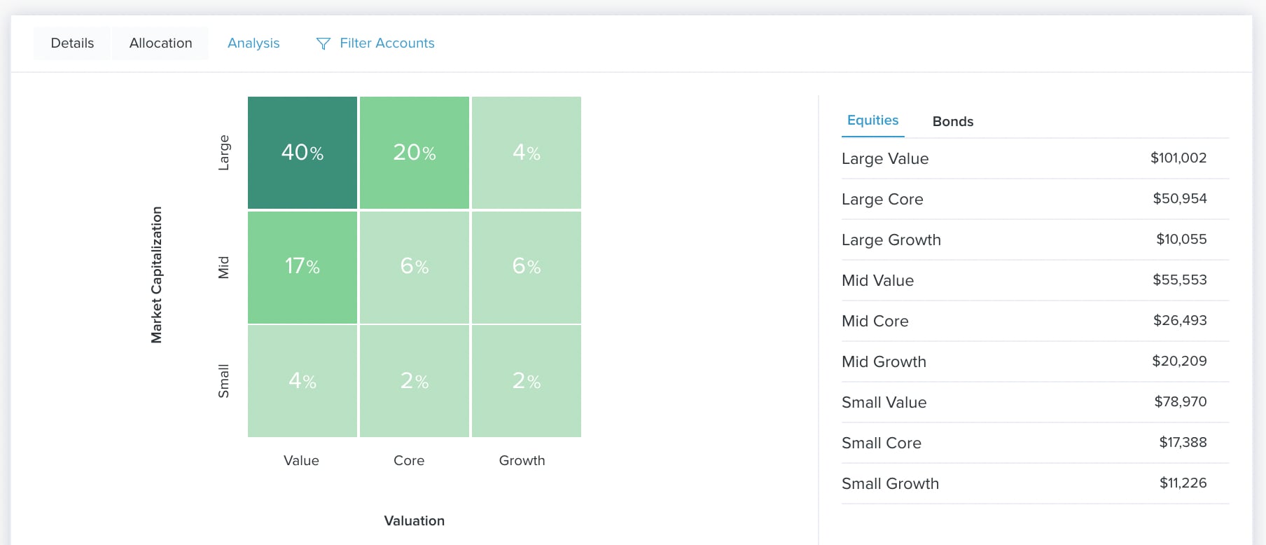
Equities
You will start off viewing the ‘Equities’ chart. The horizontal axis of the equity analysis tool represents investment valuation:
- Value: These are stocks that are seen as being underpriced by the market, or cheaper than they should be.
- Core: These are stocks that seem to have characteristics of both value and growth stocks.
- Growth: These are stocks for companies that have shown strong growth over the last few years and are likely to continue growing at a fast clip.
The vertical axis represents a company’s market capitalization — that is, the total market value of all the company's stock. A balanced portfolio will have stock from large-, medium-, and small-cap companies.
- Large: These represent the top 70 percent of the total market capitalization in a given geographic area.
- Mid: These represent the middle 20 percent of total market capitalization in a given geographic area.
- Small: These represent the bottom 10 percent of total market capitalization in a given geographic area.
Bonds
You can switch to the Bonds chart by clicking ‘Bonds’ above the list on the right.
You'll see a grid similar to the socks analysis tool. The vertical axis represents the credit quality of the bond.
- High: These bonds have a credit rating that is AA- or higher.
- Medium: These bonds have credit ratings less than AA-, but greater or equal to BBB-
- Low: These bonds have credit ratings that are below BBB-.
The horizontal axis measures the duration of the bond, which are calculated on a floating basis according to market conditions.
- Limited: The bond's duration is roughly 3 years or less.
- Moderate: The bond's duration is between roughly 4 and 7 years.
- Extensive: The bond's duration is longer than roughly 7 years.